The classic kitchen design is timeless, fresh and simple, instead of traditional, dark, and complicated. That’s a pretty wide blanket, but so are most of the definitions out there.
Instead of trying to define a style, it’s best to focus more on the elements that shape classic kitchen design.
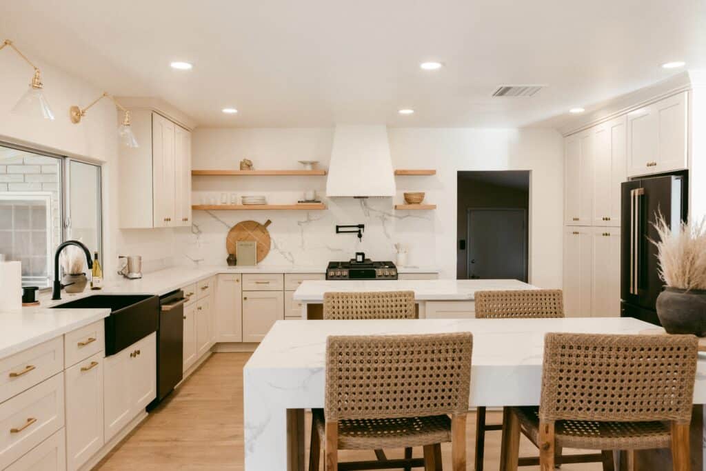
Focus on neutral cabinet colors for a classic kitchen design
Although white cabinets are popular for kitchen cabinets, and in general it’s hard to go wrong with white if broad appeal and longevity are a concern, it’s not the only option.
Any neutral cabinet color, be it off-whites, beiges or creams, greys, even pale greens or blues, can all work as a base for a classic kitchen design, while also allowing you to add a bit of individuality to your space.
Instead of focusing on color swatches, it can be easier to think of it as colors that are commonly found in nature. They help create a comforting space that feels homely and inviting.
In this case the cabinets are not meant to be a showpiece or a focal point of the kitchen. Instead, they serve as the base or foundation to the rest of the elements in your design.
Cabinet door style
After cabinet color, it’s all about the style of door front, and more often than not, a shaker style is what you find. Flat panel or slab doors can also provide that classic look if you opt for an inset construction style. However, this construction method isn’t as common anymore due to the added costs associated with the increased difficulty.
In addition to being functional, shaker door fronts bring a dependable, classic appeal, and warmth to a space. They aren’t trendy, and certainly aren’t going anyway any time soon.
The cabinets can be painted or stained a wood tone, and although we are starting to see a shift away from the fully painted kitchen to one that includes natural wood tones, the fully wood kitchen isn’t back quite yet.
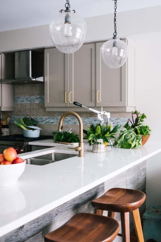
The cabinet door style and color are what form the foundation of the kitchen design. The rest of the classic kitchen design style is built up from the smaller design features we add to the space. This includes countertops, the style and texture of the backsplash, the architectural details, and using elegant finishes.
Countertops
The countertops are going to serve as the workhorse for your kitchen. They need to be dependable, yet simple, while giving the feeling or enduring permanence.
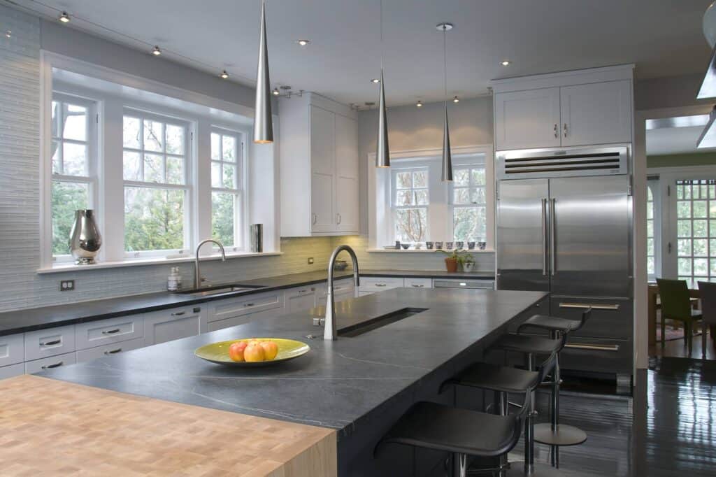
Ideally, natural materials like marble, soapstone, or granite are best suited to the classic kitchen design. However, if the maintenance that comes with natural stone countertops isn’t for you, there are engineered quartz options that will also work. More often than not, these engineered slabs will mimic the movement and veining of natural stone.
Many people will think of true classic kitchens as those with large slabs of Carrara or Calacatta marble forming the foundation or focal point of the space.
That doesn’t need to be the case. Many of the more modern classic kitchens are afraid to include darker countertop options, like honed black granite or soapstone.
While the type of material will play a role in the final kitchen design, the main goal is to achieve a natural aesthetic in the white or dark greys to blacks palette.
Architectural details and designing a classic kitchen
Architectural details are some of the most important design features when it comes to classic kitchens. They add character and build on the feeling of permanence. They are most often seen as crown molding, furniture legs or corbels on the island, furniture style toe kicks on the cabinets, and paneled hoods.
The key is to keep the details subdued, even restrained in the classic kitchen style. When these details become too ornate or attention grabbing, the design starts shifting towards traditional. The same goes for the overall aesthetic of the detail. In order to steer clear of the traditional design style, the elements should not exhibit particular frills that lend themselves to a period or era.
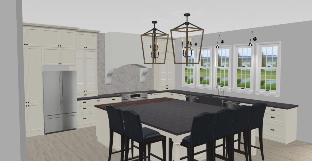
This kitchen uses several simple architectural details. First in the crown molding- it’s on the smaller side and simple in design, but still gives the cabinets and kitchen, the feeling of completeness as it ties the cabinets into the ceiling. Instead of a large crown, they opted to start with a flat panel and then add crown molding on top. Second is the simple arch between the cabinets over the window, tying the two sides of the kitchen together. Finally, we see the simple details in the island framing. A cut out to match the shaker doors, and a coved trim piece that wraps the island sides for extra detail.
Backsplash
Dare I say subway tile…
Before you tell me how much you hate, or maybe love, subway tile, this doesn’t have to be the standard flat 3×6” white subway tile. It really doesn’t matter what size in most cases. Though too large can be off putting regardless of the design style.
In can be flat, glossy, cracked, beveled, machine made, hand made, hand painted, even natural stone. The main aspect here is the square to rectangular shape, in a light grey or white palette.
Keep in mind that the size of the tile, spacing, and grout color can really change the look of your kitchen. Spacing is often tile specific, and I like to choose the grout color that pairs best with my countertop and cabinet colors. It’s also worth noting that light grout colors can fall victim to staining from the splashes and flicks of cooking.
Alright, it isn’t all about subway tile. There is really quite a wide spread of what suits the classic design. Some other options include basket weaves, herringbone patterns, even narrow pickets.
Elegant fixtures and finishes
This is all of the remaining items that go into a kitchen design – the icing on the cake if you will.
Hardware
If you look closely at photos of classic kitchens, you will quickly see they all follow a similar trend when it comes to the cabinet door hardware. Solid pulls or knobs in bold tones like black, brass, or copper. Don’t be afraid to mix it up by using both pulls and knobs, or two types of pulls in your kitchen. Two different pieces of cabinet hardware work can work great as long as they complement one another. It will even another touch layer of detail to the kitchen.
Lighting
It’s easy to overlook the importance of lighting in kitchen design.
Kitchens aren’t just a working space anymore, they are also for gathering, and in some cases relaxing. Therefore lighting needs to be bright and bold when you need it, but also subtle and muted when you want to create ambience. Avoid the urge to save money and keep the old big light in the center of the kitchen.
There is no single solution to light a kitchen, each space is unique. However, the basic layering principles for lighting should apply. There should be a combination of general lighting, often made up of ceiling lights, and task lighting, which can be anything from undercabinet lights, to pendants, to wall sconces. Finally, take the time to think about how these different lighting options are used within your kitchen.
When it comes to the aesthetics, aim for pieces that add some character to the space, aren’t overly ornate, and most of all, are practical.
Faucet
Single hole faucets tend to blend in more seamlessly into a kitchen, whereas a bridge style faucet that uses 2 or 3 holes will become more of an accent. Neither option is wrong for the space, it is all about finding balance. Classic kitchen tend to use faucets that have a rounded neck design.
No matter which style of faucet you prefer, choose one that are comfortable working at day in and day out.
The goal is to have all of these finishes work together to form a cohesive look. They don’t all need to be the same finish- mixing metals is a great way to add interest and character, but the shape or form, the characteristics of each element should be similar.
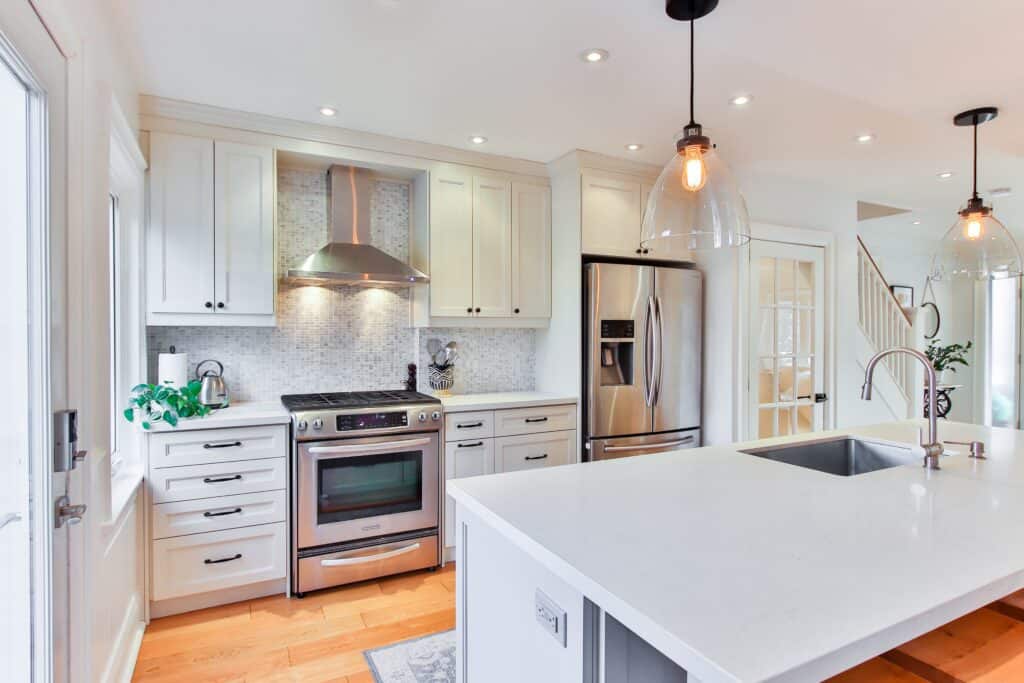
The main foundation of this kitchen is made up of classic white shaker cabinets, simple crown molding, and trim details in the island. The finishes are a mix of black and brushed nickel, and there are both knobs and pulls. All of the elements use a similar soft, rounded look to keep the design harmonious.
Classic kitchens are like chameleons. You can completely change the look of the space by swapping out a few elements. This is ultimately what makes the design style so attractive- it’s relatively easy to keep it from looking dated.
I want to hear your thoughts! What do you love about classic kitchens? Is there anything you would add to this list?
You might also enjoy:

No Comments