The shows on TV make designing and planning a kitchen look so easy! A few short seconds and you have the perfect space that not only looks great, but is also functional. If only it were actually that easy. We can do our best to set you on the right path with the help of our guide to avoiding common kitchen design mistakes.
Before reading on, I highly suggest you take a few minutes to read our post on planning the perfect kitchen layout. It is a great starting point and will provide a good foundation for the rest of this article.
I don’t want to create an endless list of possible kitchen design mistakes, so we are going to focus on some major faux pas.
The top 10 major kitchen design mistakes
1. Ignoring workflow
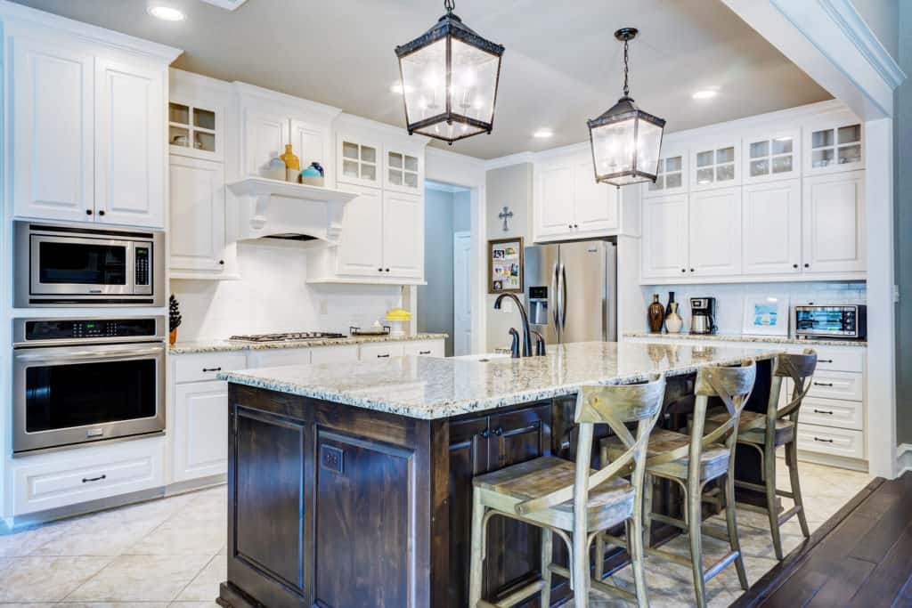
This is probably one of the most common kitchen design mistakes we come across. A good workflow is essential to functionality. The basic starting point is the work triangle. This means your sink, range/cooktop, and fridge should all be easily accessible from one another. Further, this includes the cabinetry layout and storage solutions. It wouldn’t make sense to have your pots and pans on one side of the kitchen and the stove or range on the other.
Solutions: Before renovating, carefully think about how you use your kitchen. Make notes if you have too. Ensure you have ample storage space for cutlery and dishes near the dishwasher, as well as storage for pots and pans next to the cooktop.
This is a perfect example of why I really like IKEA kitchens. They have tailored their products to work with one another from top to bottom. Their kitchen organization systems are fantastic.
2. Forgetting to include space to move
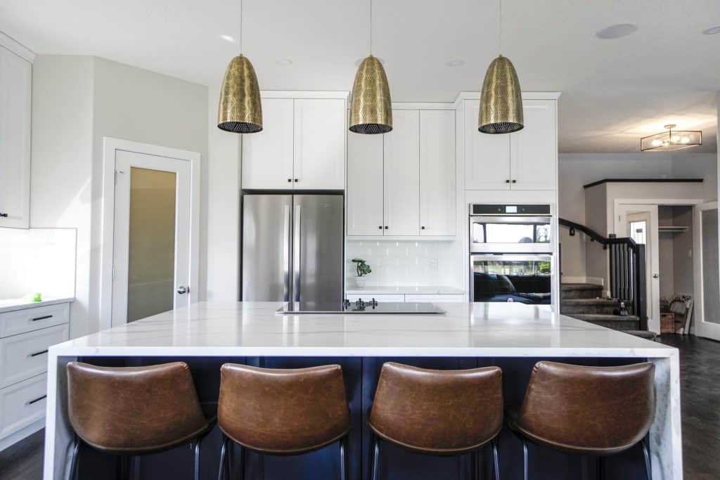
It seems like every kitchen today needs an island. Unfortunately, not every space is suited to include an island and forcing one into existence is a major kitchen design mistake. The last thing you want is a cramped and restricted space where only one person can comfortably work. If your kitchen is the central gathering area of your home, this can be even worse.
Solutions: There should be a minimum of 40 inches between countertops (and a maximum of 60 inches). This effectively allows two people to work back-to-back comfortably in the space. In addition, ensure there is enough space to open appliances without hitting anything. If the island is too far away, it will feel like an unnecessary waste of space (more on this below).
3. Wasting storage space
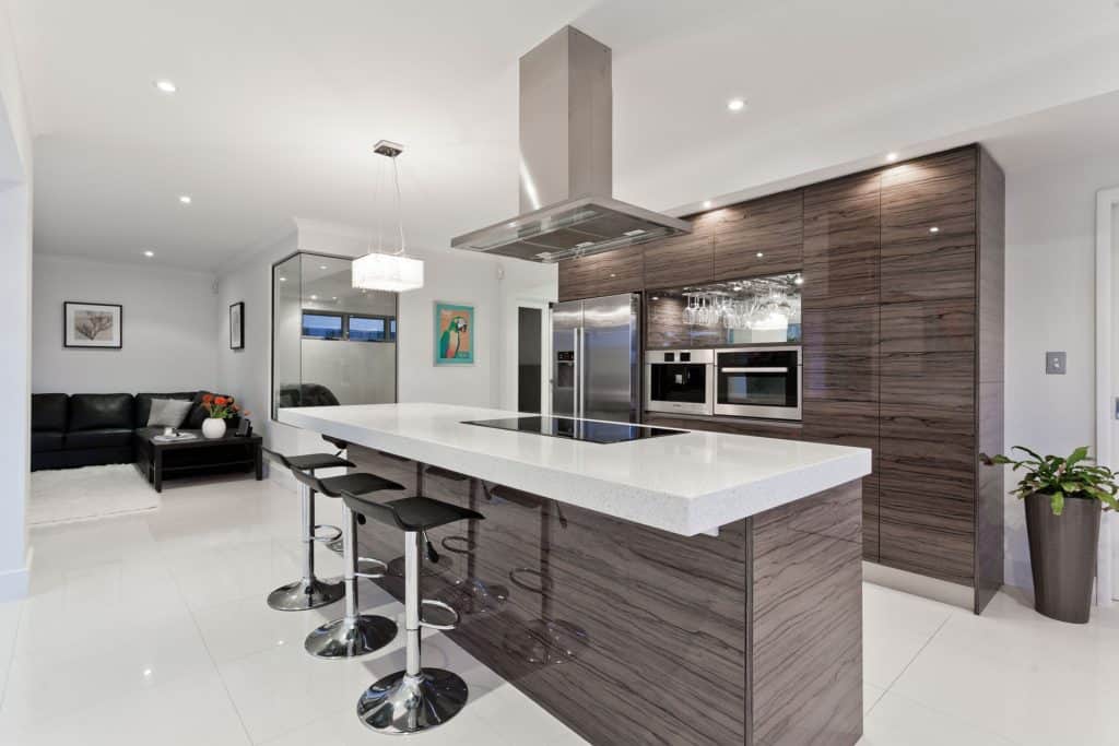
There is a fine line between maxing out every potential storage option and a space that is so stuffed you can’t help but feel claustrophobic. Including too much open shelving is a common kitchen design mistake. It looks great in a staged photo on Pinterest, but not so much in a kitchen that is used daily. That isn’t to say that all open shelving is bad- it really isn’t. It should just be done in moderation with storage and function coming first.
Solutions: Take a step back and examine where you can sneak extra storage into your kitchen. Take advantage of tall kitchens with floor-to-ceiling storage. In smaller spaces, include custom storage behind filler panels or in the cabinet toe kicks. It takes a little extra work, but the payoff is well worth the effort.
4. Poor lighting
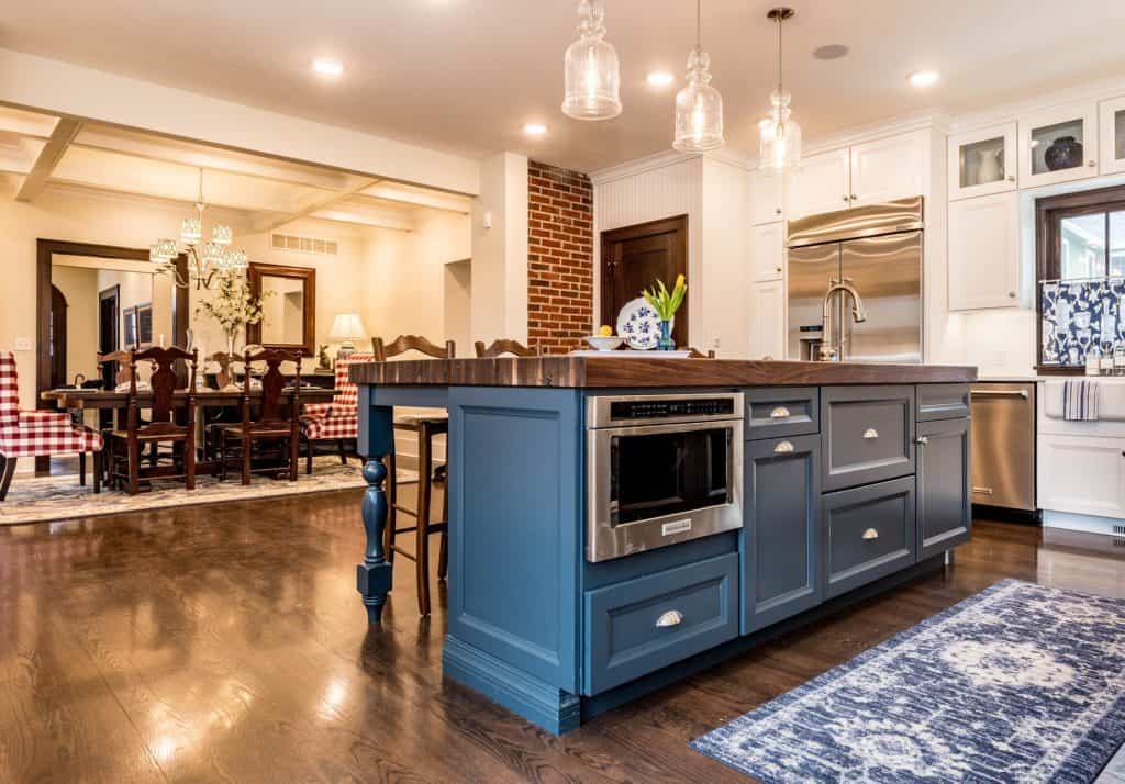
Lighting is one aspect that is often overlooked in any room, never mind in the kitchen. To avoid this kitchen design mistake, think about functionality and how the space will be used. Another common mistake is prioritizing aesthetics over purpose. Many lighting options are visually appealing but completely impractical when it comes to working.
Solutions: In our home renovations (as well as in the designs for clients) we suggest that lighting be placed along the edge of the work space, just in front of you. This means pot lights/downlights are placed 20-24″ off the wall, thus sitting roughly parallel with the edge of your countertop. In addition, placing pendants, pot lights, and sconces on separate circuits will allow for easier control and ambient lighting when needed.
Work with us at Homestud Studios to avoid these kitchen design mistakes
5. Wrong appliance sizing
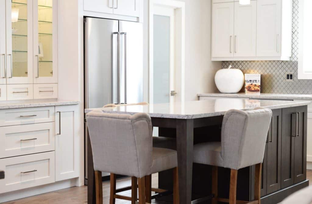
We mentioned earlier how important appliance location is in the overall design. Appliance sizing is equally important. The last thing you want is a monster refrigerator that is far too deep for the space. This can have a major impact on the rest of the kitchen design, restricting movement or impacting other cabinet doors and drawers.
On the other side of the coin, forgetting about small appliances can also be a mistake when kitchen planning. Without thinking about storage, they end up sitting on the counter taking up valuable prep space.
Solutions: In our designs, we always try to opt for counter depth refrigerators unless we have room to recess the back of the fridge into the wall. This not only improves the kitchen aesthetically, it also keeps the fridge neatly tucked away from the traffic areas. Measure small appliances ahead of time and plan for their storage in the design. If they are only used sparingly, consider storing them in a blind corner cabinet. If it is an appliance used daily, it will need a more functional location, such as an appliance garage or tailored cabinet.
6. Ignoring utilities
They are boring, you don’t see them, but they will impact how your kitchen functions. What are they? Your utilities- specifically plumbing and electrical.
It is important to remember that building codes exist around utilities. For example, the amount of linear feet of countertop per outlet, whether or not an appliance needs a dedicated circuit, or how a kitchen sink drains and vents. Some of these aspects can be immovable or very expensive to move. Utilities are crucial to the function of your kitchen once complete, but need to be addressed in the very first stages of a renovation.
Solutions: We highly suggest having a complete kitchen plan prior to getting started. This allows trades professionals time to complete the necessary work behind all of the beautiful finishes. It will also let you know if the design you envision is practical (more important for plumbing).

7. Wrong worktop height
One of the most frustrating kitchen design mistakes is having the wrong worktop height. Prepping food or washing dishes at the wrong height will be incredibly frustrating. Further, it can actually be bad for your health, leaving you with a sore back from hunching (countertops that are too low is a more common kitchen design mistake than having them too high).
Solutions: The ideal working height for countertops is around 36 inches or 90 centimeters. This can be tailored slightly in either direction depending on who will be the primary user. If you and your partner have drastic height differences, you can consider bi-level countertop heights if you have the space.
The final design mistake when it comes to worktop heights is a lack of consistency. Keep your countertops at the same height throughout the kitchen for a cohesive look (aside from a purposeful bi-level prep area). You would be surprised how accurately the human eye can pick out different heights in a space.
8. Wasted space
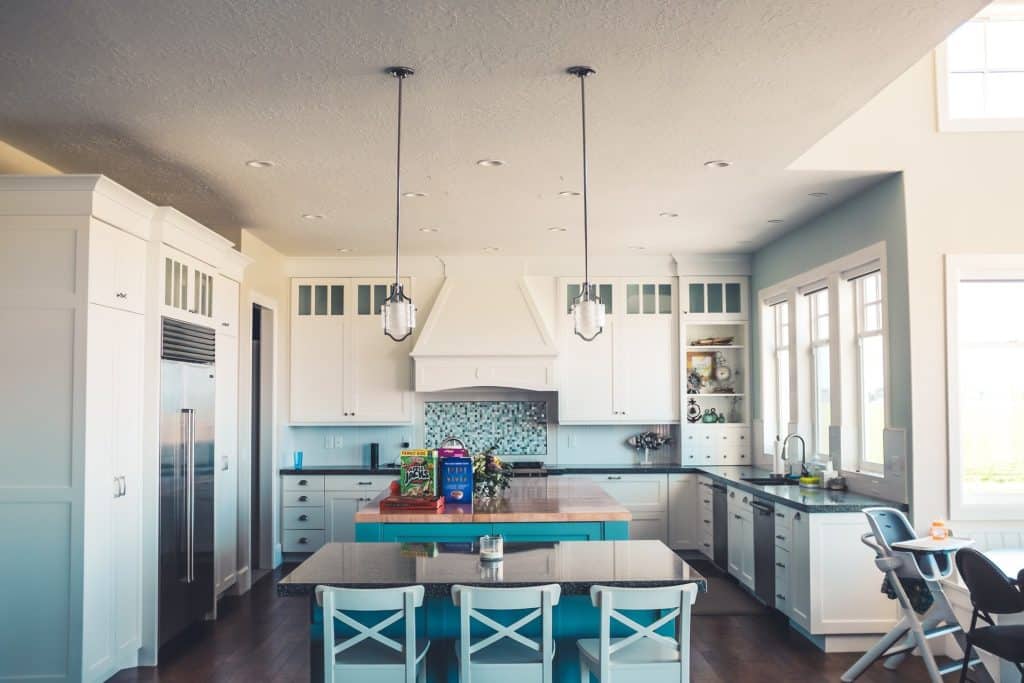
Wasting space is a kitchen design mistake that goes hand-in-hand with mistake number 2 (forgetting to leave space to move). If you have the room, kitchen islands are a great way to increase cabinet storage, countertop space, and seating. However, if you feel like you are trying to force an island into the space, your kitchen will likely feel crowded. Thus the island actually becomes a waste of space. The same goes for not including extra storage and countertop area in a large kitchen design. This can mean adding either an island or peninsula.
Solution: Take advantage of the extra space you have and include an island or peninsula in the design. This will not only give you more work space, but creates additional gathering areas when entertaining. And if you just don’t have the space, forgo the island- your future self will be thankful.
The same goes for expansive open walls. Just because you had a galley style kitchen before, doesn’t mean you need to keep the layout when renovating. Take advantage of the space even if it is a few steps further away.
Solution: If you are worried about it making the kitchen look too spread out, consider a secondary color for the cabinets. This differentiates the space from the main kitchen area and offers an aesthetically pleasing variation to the design.
9. Assuming you need a new layout
There I said it! Not every kitchen redesign needs a new layout. Sometimes the space just needs a rework and reorganization, but the general layout can stay. Avoiding this kitchen design mistake can payoff not only in keeping the best functionality for the space, but also save you thousands by not moving utilities.
Solutions: Before planning a new kitchen design, decide if the space does not work functionally or if you really just want an updated look. If the original plan made sense, there is nothing wrong with installing a new kitchen purely for aesthetic purposes.
10. Playing it too safe
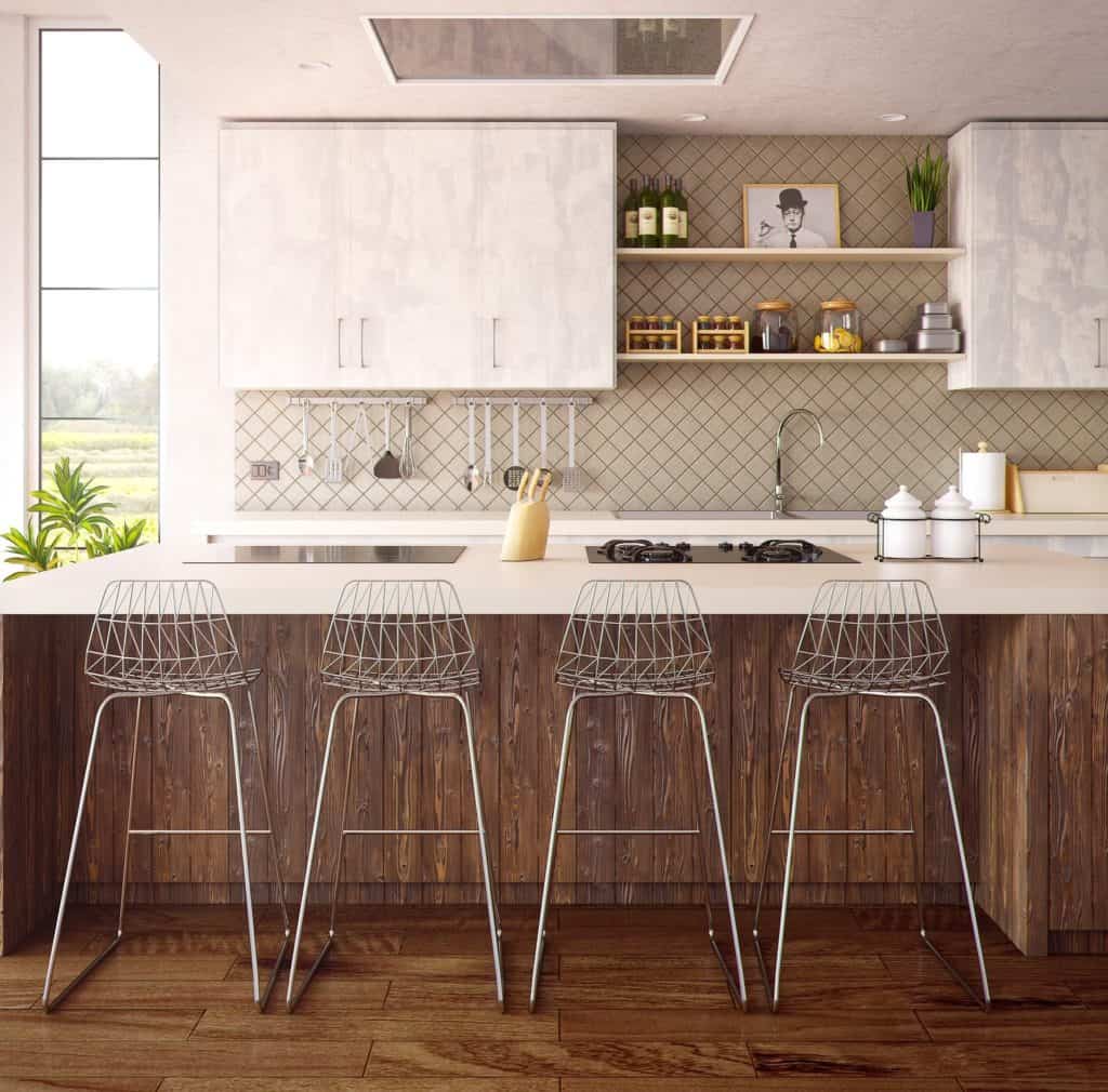
This isn’t so much a common kitchen design mistake as an annoying trend among new builders. The kitchen is a space you are going to spend several hours a day working, hanging out, and passing through. Why not make it somewhere you love being! Yes you have to think about resale and creating a space that won’t look dated just a few years down the road. But you also need to have some fun in life!
Solution: Add subtle design touches that reflect your life and your style. The key to this is to do it in a way that can easily be changed. For example, rustic or industrial island pendants, a farmhouse style kitchen faucet, or even the cabinet hardware all have a major impact on the overall design. In addition, they are easily changeable down the line without major expense.
We want to hear from you. What would you change if you could plan your kitchen design and layout again? Share your do’s and don’ts in the comments.
You might also enjoy:

No Comments